Design

Keynote: 2021 Winter Games Conference

Learning Futures: Designing the Horizon

I was thrilled to deliver the opening keynote address for the 2021 Winter Games conference, hosted by ASU’s ShapingEDU community and partners. Below is the publicly shared Zoom recording. Special thanks to my colleagues Dr. Punya Mishra and Jodie Donner for joining me in sharing our work.

Additionally, we also just released the second installment of our special issue in the ASU Journal Current Issues in Education, an Open Access Journal.

Vol 22 No 1 (Special Issue) Shaping the Futures of Learning in the Digital Age Part 2

Slice of PI Podcast Appearance: Part 2

Part 2 on MLFTC’s IgnitED Labs with Dr. Sean Leahy, Director of Technology Initiatives, and Jodie Donner, Lead Technology Strategist and Head of IgnitED Labs.
— Slice of PI

This is the second of our two-part interview with Claire and Hannah from the Slice of PI podcast. We had so much to say in our interview they had to split it into two episodes (IgnitED Labs Interview Part 1).

For more information on the labs discussed, please head over to the IgnitED Labs website to see what we’ve been up to.

Smart thoughts: Designing the future

I was recently asked to share my thoughts on the future as a design space in a short essay for the launch of The Guide Project. The goal of the Guide Project is to connect the communities of practice designing the future. The Guide’s aim is to “accelerate novel, audacious, ways to improve - and then create - human futures in which we can thrive.”

The Guide Project is an inititative run out of the ASU Herberger Institute for Design and the Arts. Needless to say I was honored to contribute a small piece of writing to this impressive project.

“Let’s think the unthinkable, let’s do the undoable. Let us prepare to grapple with the ineffable itself, and see if we may not eff it after all.”
— Douglas Adams (1987)

I wrote this short essay based on the prompt: The human future as a design space – what does that mean to you?

This essay appears along 29 other contributors in the section entitled “Smart Thoughts about designing the future”. I approached this this essay by considering a preferable future space designed to leverage technology in the near-ish distance of 20-35 years and what that might look like from a personal-to-physical space interactions. This future scenario also takes the assumption that we are well into the Fourth Industrial Revolution brought on by the Third Age of Computing. Putting aside all of the potential challenges and factors that might militate against this preferable future, I presented the following exercises in thought.

Online Article: Design Your Life-Long-Learning Places For an Augmented You

Written by Dr. Sean Leahy, with editorial support from Dr. Joel Garreau

3D Printing Workshop

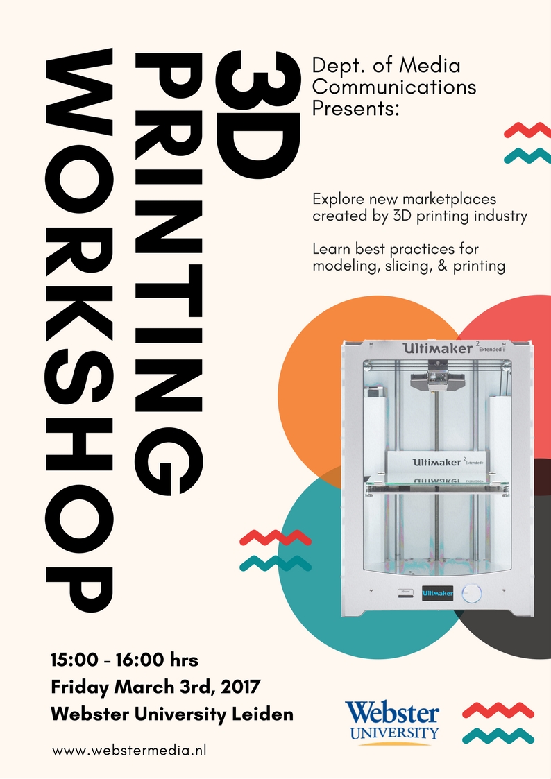
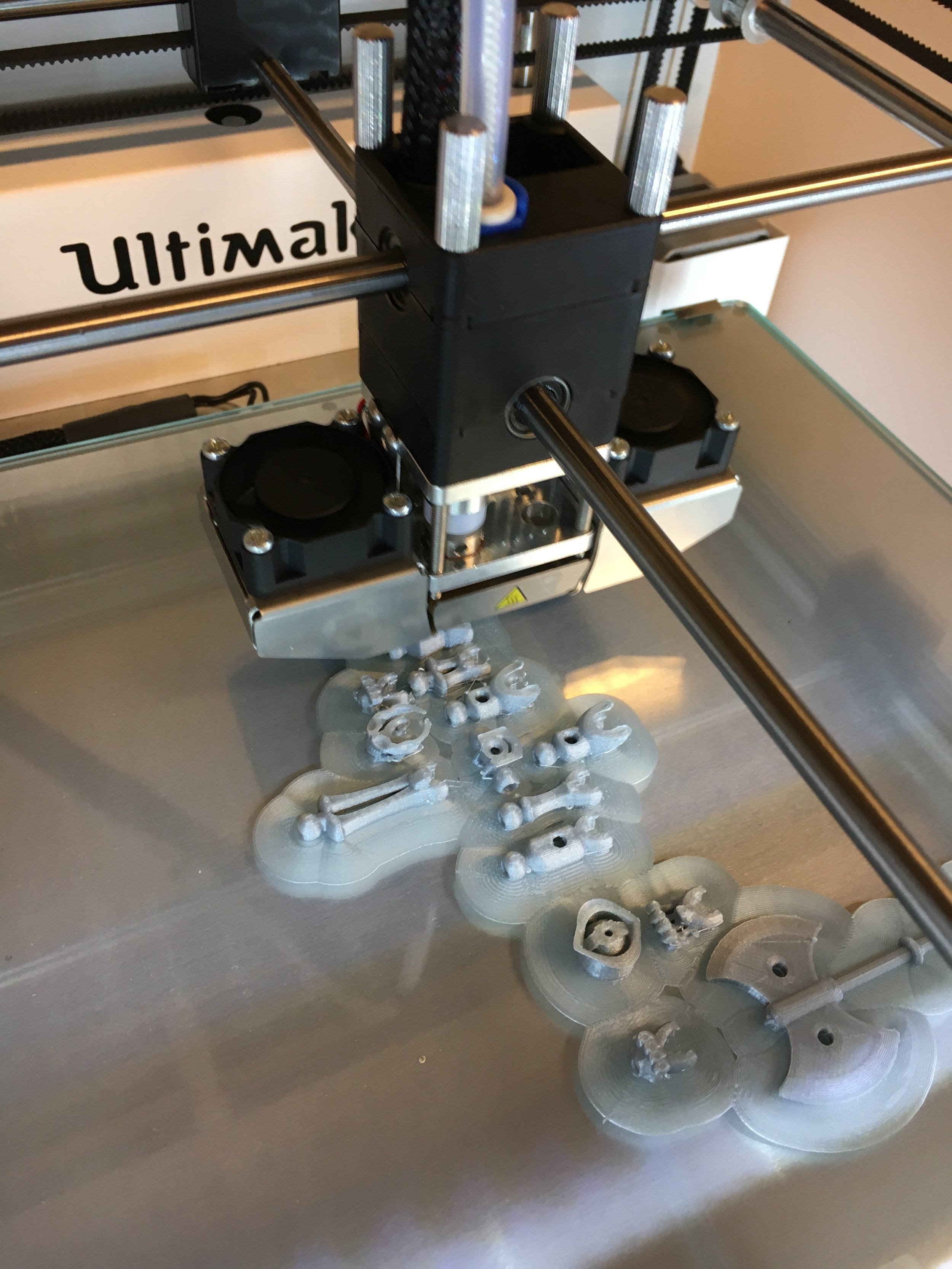
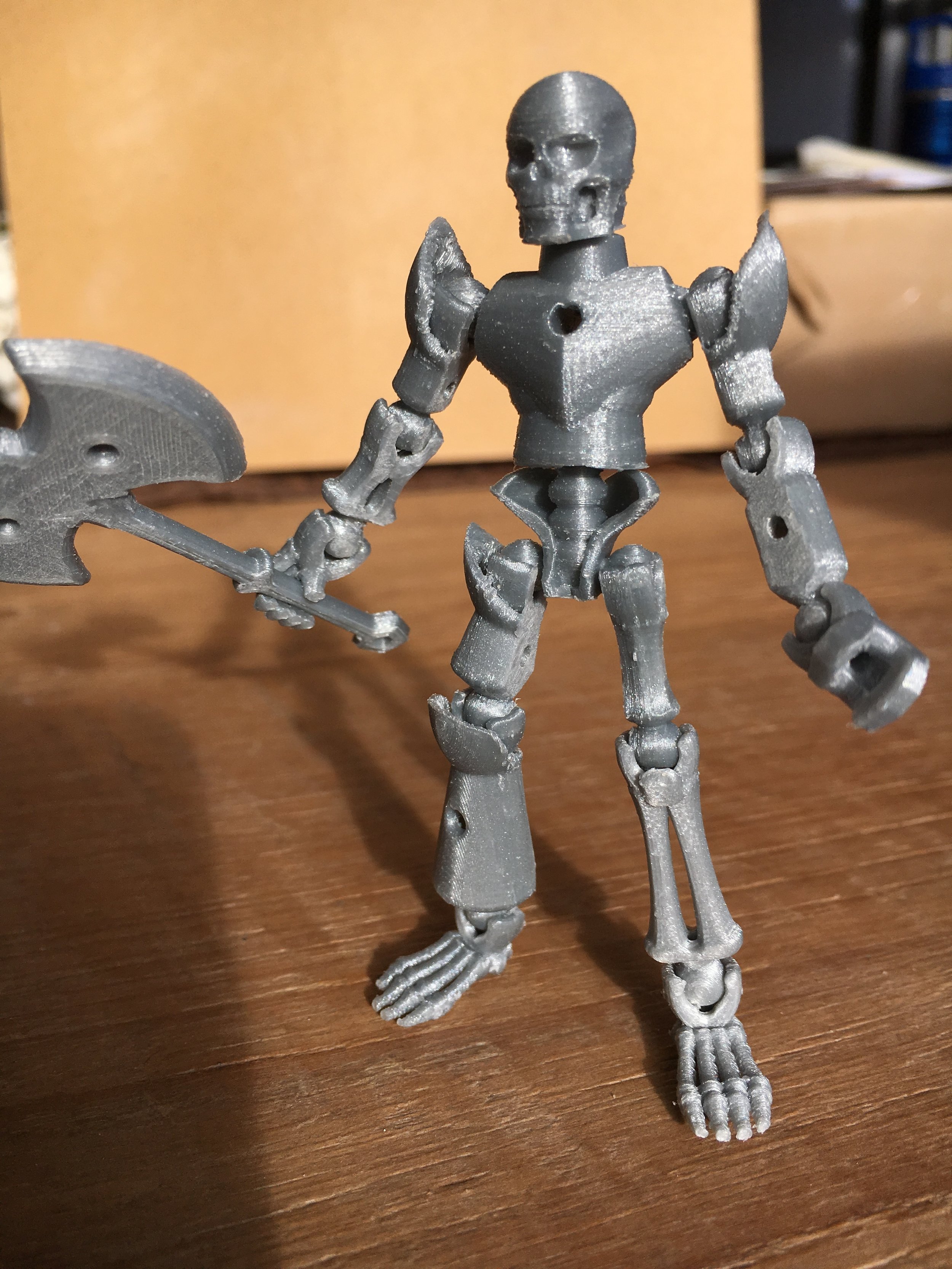
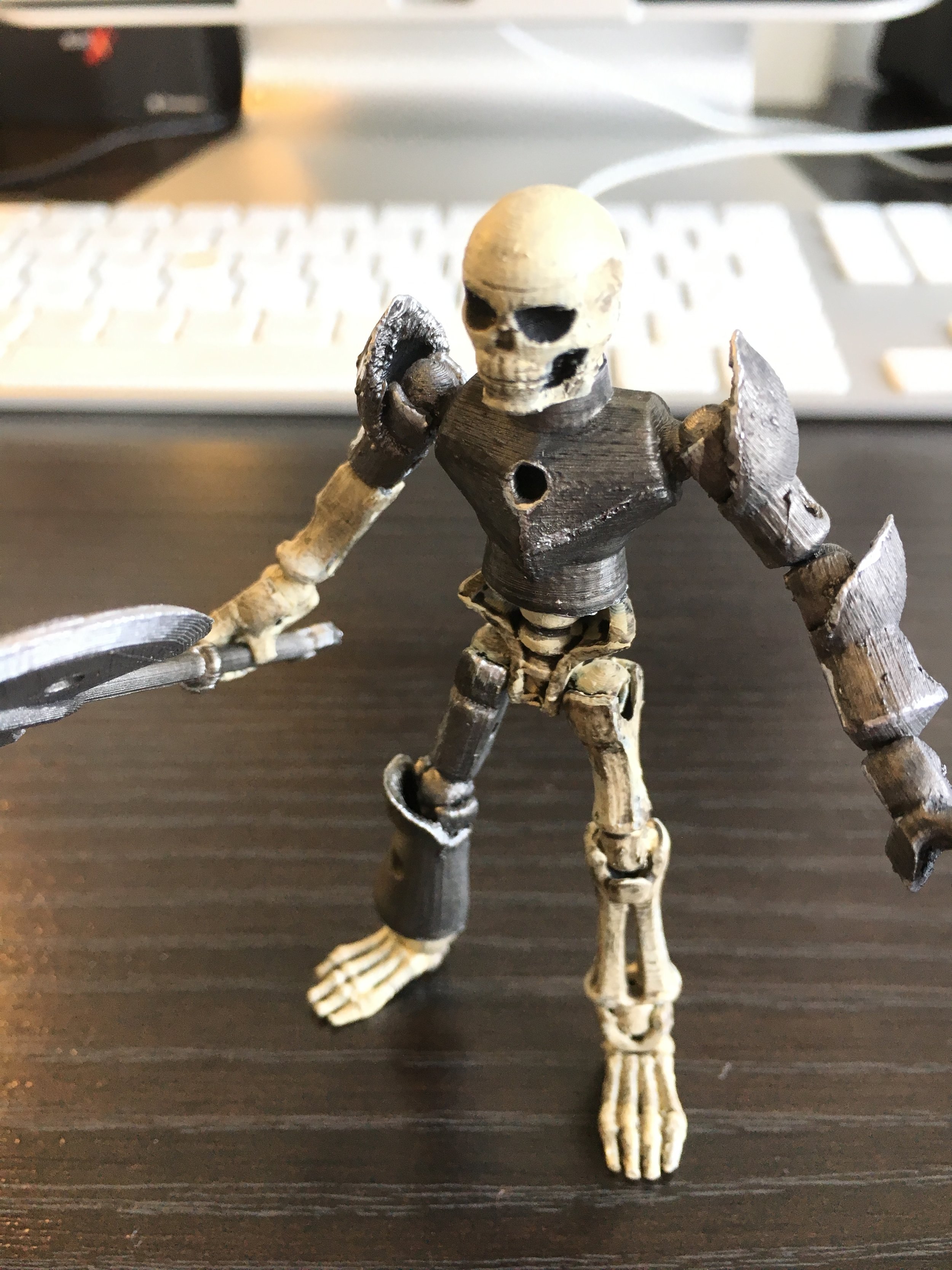
On Friday March 3rd, 2017 I co-hosted a workshop for 3D Printing.  This particular workshop was focused on the introduction to 3D printing, learning the origins, and the current economic and educational implications.  We also discussed the best practices for learning to model 3D objects for print, slicing, and of course the fun part, printing.

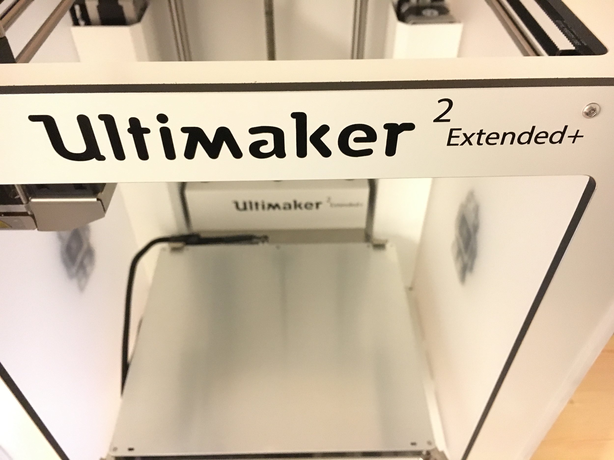
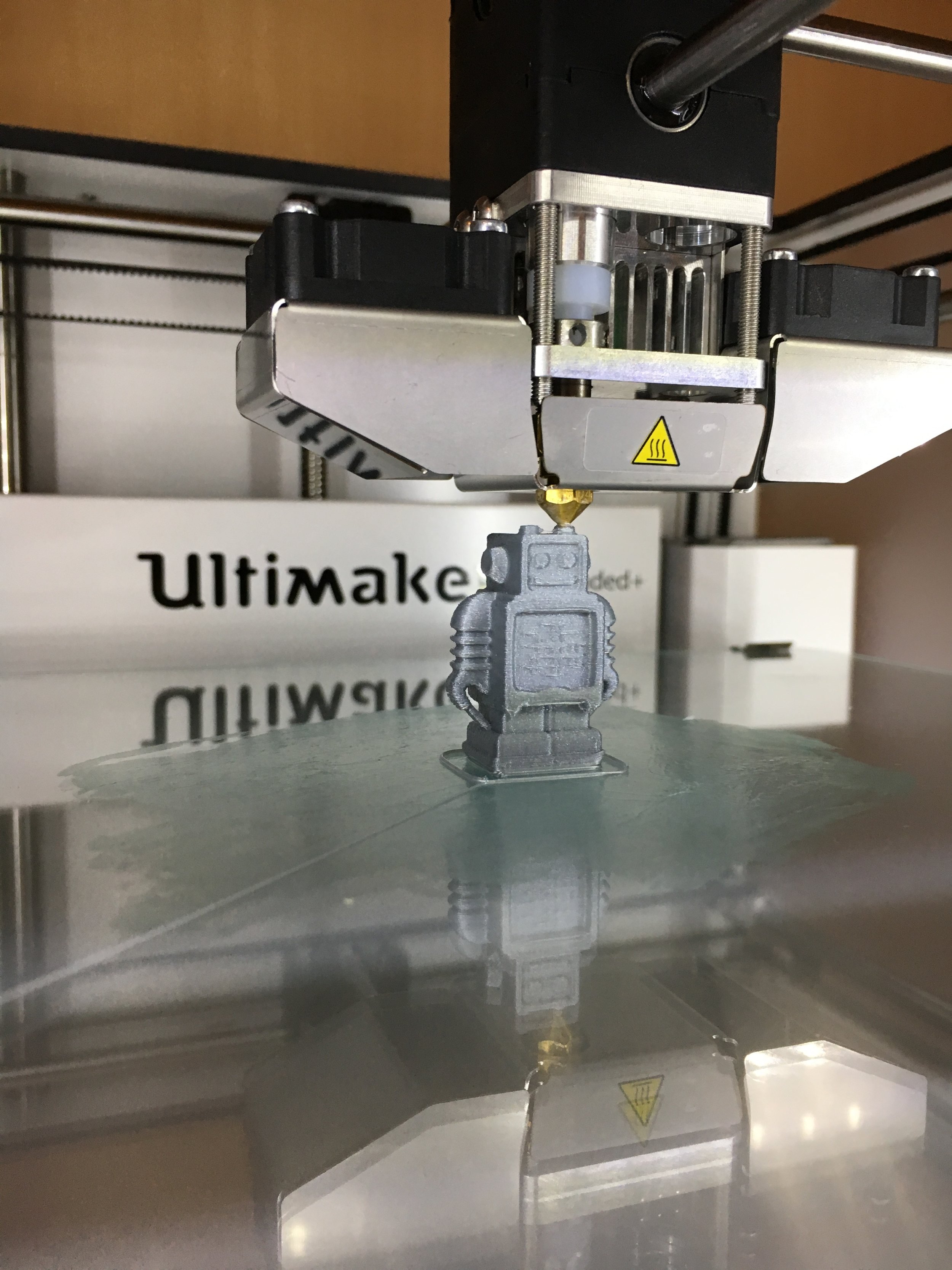
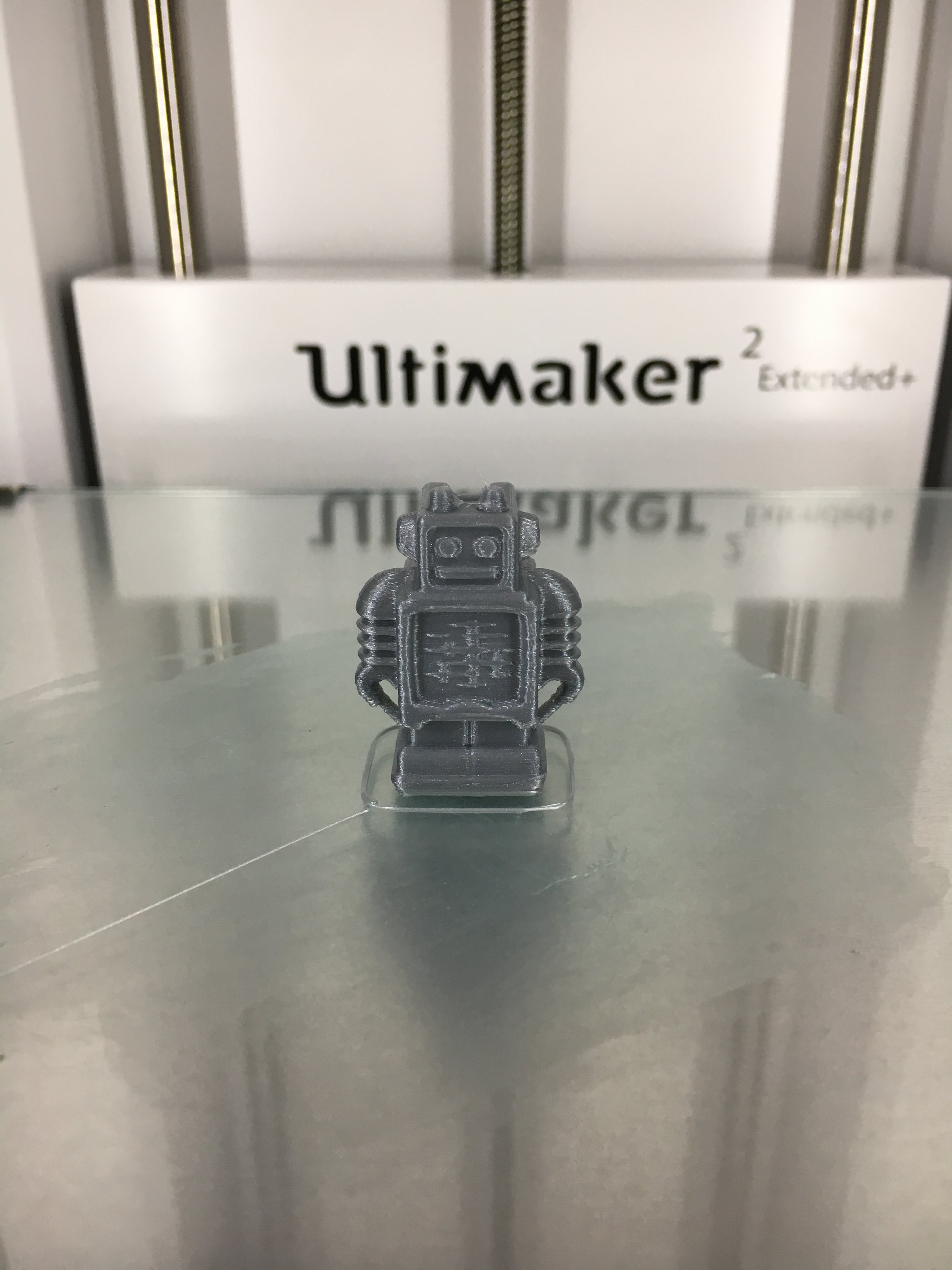
Below are a few images from a couple of the prints.  One print (the skeleton figure) was printed, cleaned, and then painted.


Workshop Resources

The workshop was split into 3 sections [3D modeling in software, preparing prints, and physical printing].  We have been working with the Ultimaker 3D printers and have found their online resources to be incredibly helpful for the entire process of 3D printing.  https://ultimaker.com/en/resources.  

3D Modeling
To kick things off from a beginners perspective we focused on the use of free open browser-based 3D modeling suit TinkerCAD. TinkerCAD is a great online source for learning the fundamentals of 3D modeling and best of all, its browser based, so no expensive software is needed.  After just a few minutes of their tutorials you will be creating 3D objects (simple ones anyway) with ease.

Preparing prints
Since we are using an Ultimaker Extended+ 2 we introduced a 3D slicing application that is specific to our hardware called Cura.  Cura is an open source 3D slicing application that allows you to import 3D Model files that are in the form of (*.stl, *.3mf, or *.obj) files. Once imported the Cura software allows you to further optimize your object for print by controlling the density (fill), resolution (fine detail), and other aspects like brim.

Physical printing
In this final section we walked through the startup, calibration procedures, and print surface preparation.  We also discussed the filament selection (type of plastic to be used).  We worked with the standard PLA material for its generalization of application and ease of use in the machine itself. Once we worked through the procedures we printed a small set of earnings as a live demonstration.

After we completed the formal portion of the workshop, attendee were encouraged to get their hands on the printer, material, examples, and to ask questions and print small objects if they desired.  Overall, it was a great workshop with lots of excited and enthusiastic participants and we look forward to running more workshops that cover the next steps and getting deeper into the science and art of 3D printing.

Disrupting the JPEG

I wanted to share a fun activity or in-class exercise I use when teaching advanced levels of digital imaging.  Most of us are very familiar with the JPEG file type. It is a staple commodity in our daily digital lives; we post, share, download, and save JPEG image files all the time without much thought.  However, we often forget that beyond the surface level obvious use for JPEG images, we can use this file format to rekindle the organic nature of randomly effecting change in the medium to produce unexpected and uncontrolled results. 

Original JPEG Image: Taj Mahal

Original JPEG Image: Taj Mahal

Disrupted JPEG Image

Disrupted JPEG Image

This exercise was originally based on the tutorial: "Breaking the JPEG - by Stephen Hislop of Computer Arts Magazine" before the magazine's web presence changed CMS's and lost the imagery from the post.  Please feel free to follow this exercise yourself and have some fun, or to re-purpose it to fit your needs (assuming you are teaching a class or course on digital images or compression etc.) I included a short video tutorial so you can see the steps below in action.

Purpose

The Purpose of this activity is to give participants a chance to take a closer look at the code that is generated by the JPEG image compression format, and to gain an understanding of what happens when we change that code in random, arbitrary ways.   This activity also provides each participant the tools to create unique and "organic" works of art that defy the original code structure of the JPEG file by disrupting the source code. 

You might be asking how are we going to do this?  Well, we’re going to tear an image apart from the inside out and then put it back together.

Step 1: Source image

To begin with, select an image file (*.jpg, *.jpeg) that you would like to use.  This activity works better if you choose a lower resolution image (web-sized) since the amount of code will be reduced in the file.  I personally recommend an image around 800-1,500px in the longest dimension at a resolution of 72ppi.  You can of course experiment with all kinds of sizes and resolutions once you have the process down. For this tutorial I'll show you the image I used along the way.  Due to the trial and error approach to this activity, it's a good idea to use a source image, and them make copies from it to experiment with.

Source Image JPEG file (1500 x 787 px @72ppi)

Source Image JPEG file (1500 x 787 px @72ppi)

Step 2: Convert JPEG to Text

Once you have your source image you will convert the image to text by renaming the file extension. 

  1. Right click your image file and select "Rename"
  2. Replace the ".jpg" file extension with ".txt" to convert the image file type to a text file.
  3. You may get a pop-up warning dialog box asking if you want to replace the file extension - select the option to use the new ".txt" extension.
  4. Your image file thumbnail image may have already changed to a text icon.  Now select your image text file and open the file with a text editor (TextEdit on Mac or Notepad on PC etc.).
Rename file: change extension to ".txt"

Rename file: change extension to ".txt"

Yes - we are sure we want to ruin the file ;)

Yes - we are sure we want to ruin the file ;)

Step 3: Get your hands dirty

  1. With the file open you will see that the image has been converted to a mess of tortured looking text, what you are actually seeing is the ASCII representation of the file code.  All of those lovely 1's and 0's are still there of course, but since we used the ".txt" extension we see what those bytes look like as text characters.
  2. Now comes the fun part - scroll down through the image roughly to the top 1/8th of the document.
  3. Make a selection of the code and copy/cut the code (big or small does not matter, you can vary the size as much as you like).
  4. Scroll down a ways (roughly another 1/8th of the way) and paste the code.
  5. Now try and grab another section and copy it (but leave in place).
  6. Now scroll to a new location and paste it in.
  7. Repeat these steps (3-6) a few times until you have jumbled up some of the code.
Grab random sections of code and copy/cut/paste the code to new locations

Grab random sections of code and copy/cut/paste the code to new locations

***Hint: When you are first trying this out, I would start off by making only a few changes maybe 3-4 changes and then see how it turns out.  There is no "rule" for this, so you will need to experiment with different amounts of code and whether you are copying or cutting etc.

The main thing to keep in mind during this stage is that all of this code represents corresponding parts of the image, so the bigger chunks of code you take the bigger (or more pixels) you will be disrupting.  Another tip would be to stay away from altering the very top 1/8th or very bottom 1/8th of the code, that seems to corrupt the image more often than not.  But again, you are free to experiment.

Step 4: Return from whence we came

Now that you have changed up the code its time to put this file back to an image file type.

  1. Save your work in the current form of the text document to lock in your code changes.
  2. Now reverse our file naming process from Step 2 -
    1. Right click the file and select "Rename"
    2. Change the file extension to ".jpg"
    3. Confirm you want to use the "jpg" file extension if prompted by a warning dialog box.
  3. You will now have a disrupted JPEG image file.  You can preview your file and see the wondrous "random" effects your copying and pasting had on the image. 
  4. If you are unsatisfied with your first try, try again, or choose a different image.  The point is to keep experimenting.  Once you've learned the process it only takes a few minutes to go through the entire image transformation.  Below I included a few results from the source image used in this tutorial. 

If your image is completely broken (which happens a fair amount) you might have broken parts of the code near the top or bottom of the file resulting in an image so disrupted it is no longer recognizable as an image.  In this case don't sweat it, just grab another copy of the source image and try again, but use less aggressive changes, and try and stick to the middle of the image where the code is "safer". 

You might have a scenario where you can preview the image fine, but it wont open in an image editing program like Photoshop.  Again, no sweat, just grab a screen shot of the preview and now you have a "clean" image file of the disrupted one. 

Step 5: Turn it up to 11 (optional)

  1. Now that you have a fun disrupted image you can further the enhancements to this by opening the file in Adobe Photoshop or whatever image editing application you like.
  2. You might look to enhance colors - make custom selections on the broken segments and alter them to your hearts content.
  3. Have fun! :D

Like what you created? Share it! Feel free to tweet your creations at me, or share via Instagram - @seanthenerd #DisruptedJpeg


Chalkboard Art - a creative muse

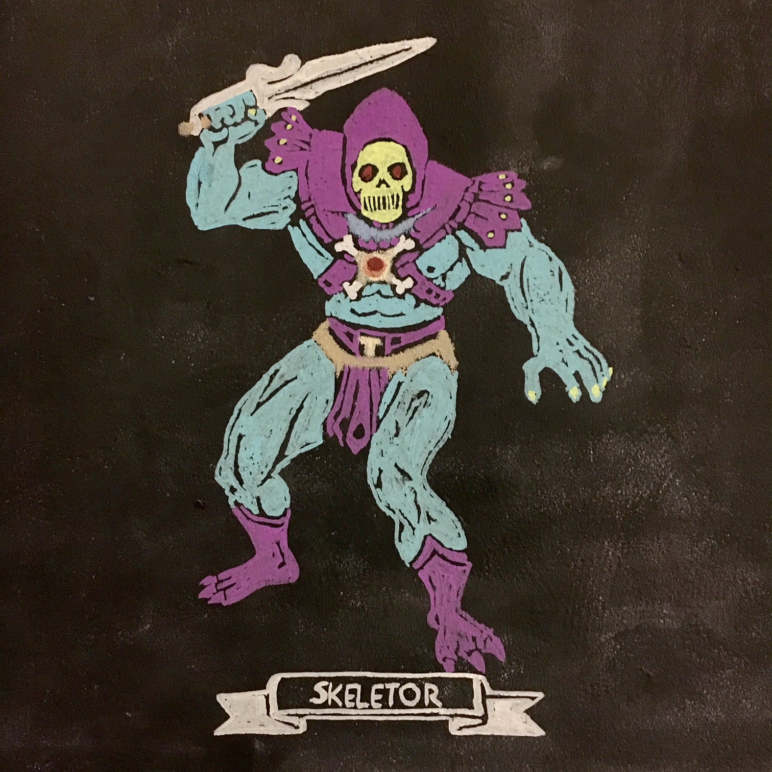
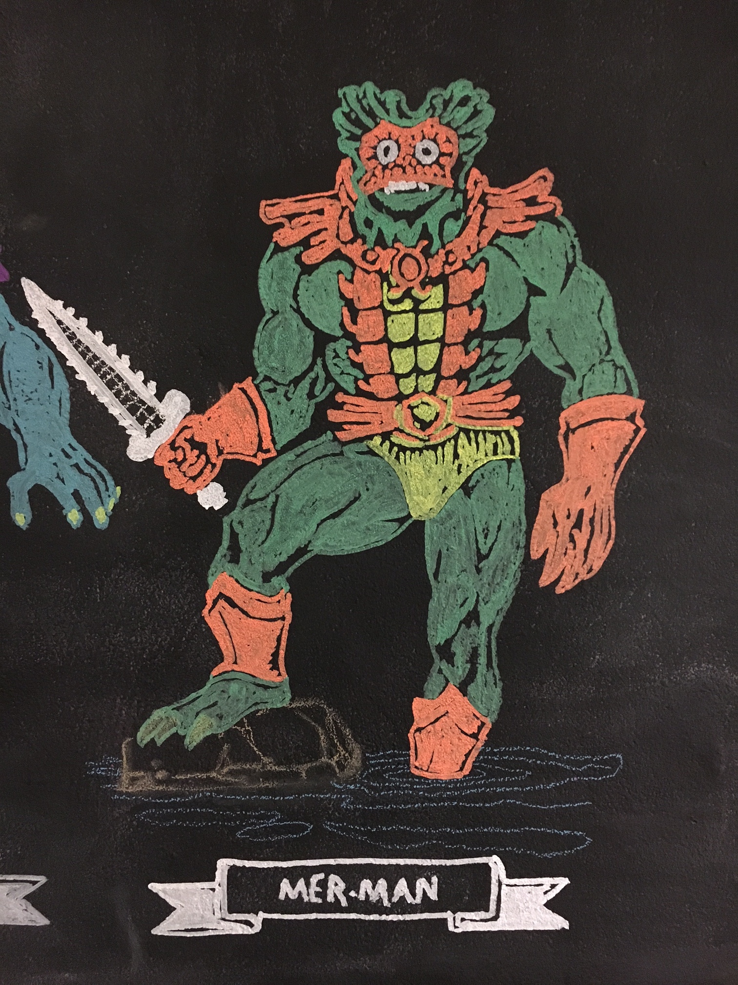
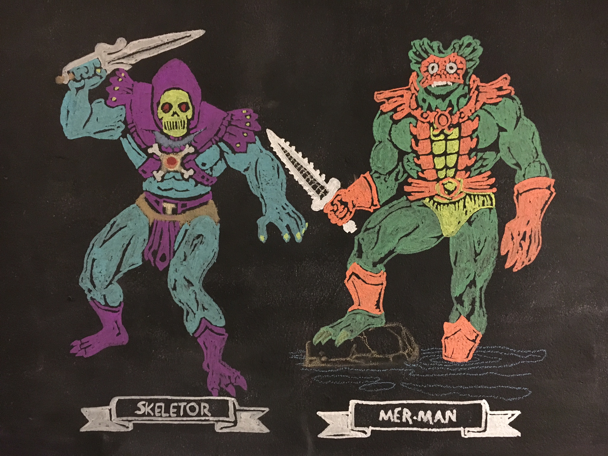
In an attempt to drum up some creative inspiration I began playing around with an idea of creating some fun chalk drawings in my Media Studio.  The idea came to me shortly after installing a "chalkboard" wall in the studio.  It is a very simple setup really; I used two coats of the chalkboard paint from a local hardware store to create the chalkboard wall measuring 1 meter by 1.5 meters or roughly (3 ft x 5ft).

After purchasing a selection of chalk, both the traditional classroom stuff and the amazingly fun liquid chalk markers I started looking for something fun to put on the wall to demonstrate how the wall can be used for fun, diagrams, or storyboarding etc. but to also show that the various types of chalk can be used for a variety of purposes.  The liquid chalk is great, but it requires water to be removed. The chalk pens came in two sizes and I opted for the larger (16mm) so now it's on my list to get the smaller (8mm) size for drawings/tracings etc. with finer details. When I started looking through the chalk and started to play around with them they reminded me of crayons as a kid, then the idea struck me, "for fun, why not put up images from an old coloring book"?.

The Process: Its super easy

Interested to make your own? It's super easy and this could be a great activity for a classroom, or with kids (of all ages) at home.  You could easily transfer this process to a "real" wall for some cool murals.  The materials needed: an image, chalk, a place to put it (chalkboard), and a projector.

The Art - What will you draw/trace?

To start with, you will need some art of course, I used a scanned image from an old HE-MAN coloring book from 1984 that I colored in digitally with Adobe Photoshop (which is totally optional, but it took the decisions out of which color to use). You can do an image search for coloring pages etc. to get a sense of whats out there.  Keep in mind your availability of colors etc. and I would suggest choosing something that is fairly simple (less details) to start with to get the process down.  Once you've made your selection get it into an image format that you can use with your projector and get ready to draw.

Setup the space

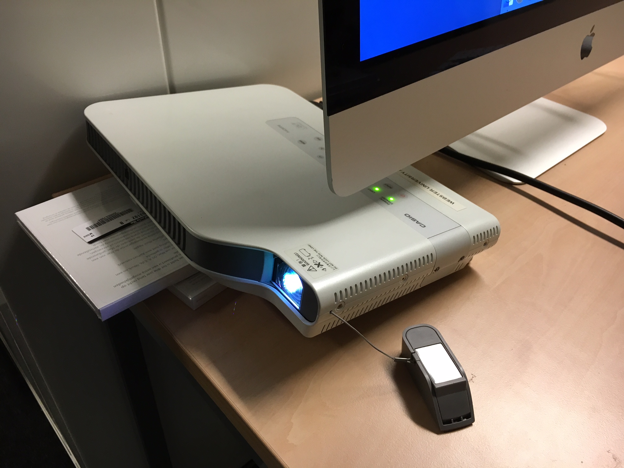
The key here is to align the image on the chalkboard just how you like it, and to lock the projector down to ensure that it won't move on you, since you will trace the image stability is key.  Tip: the fancier your projector the more flexible it can be based on distance, keystone, and scale.  See the image below of my setup, just had a projector on a nearby table and scaled the image to fit the right size.

Projector setup: note the technical use of old CD cases to get the angle "just right".

Projector setup: note the technical use of old CD cases to get the angle "just right".

Aligning the 2nd image next to the first character.

Aligning the 2nd image next to the first character.

Trace the image

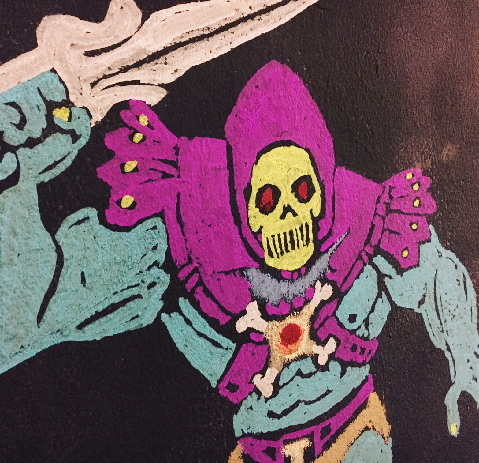
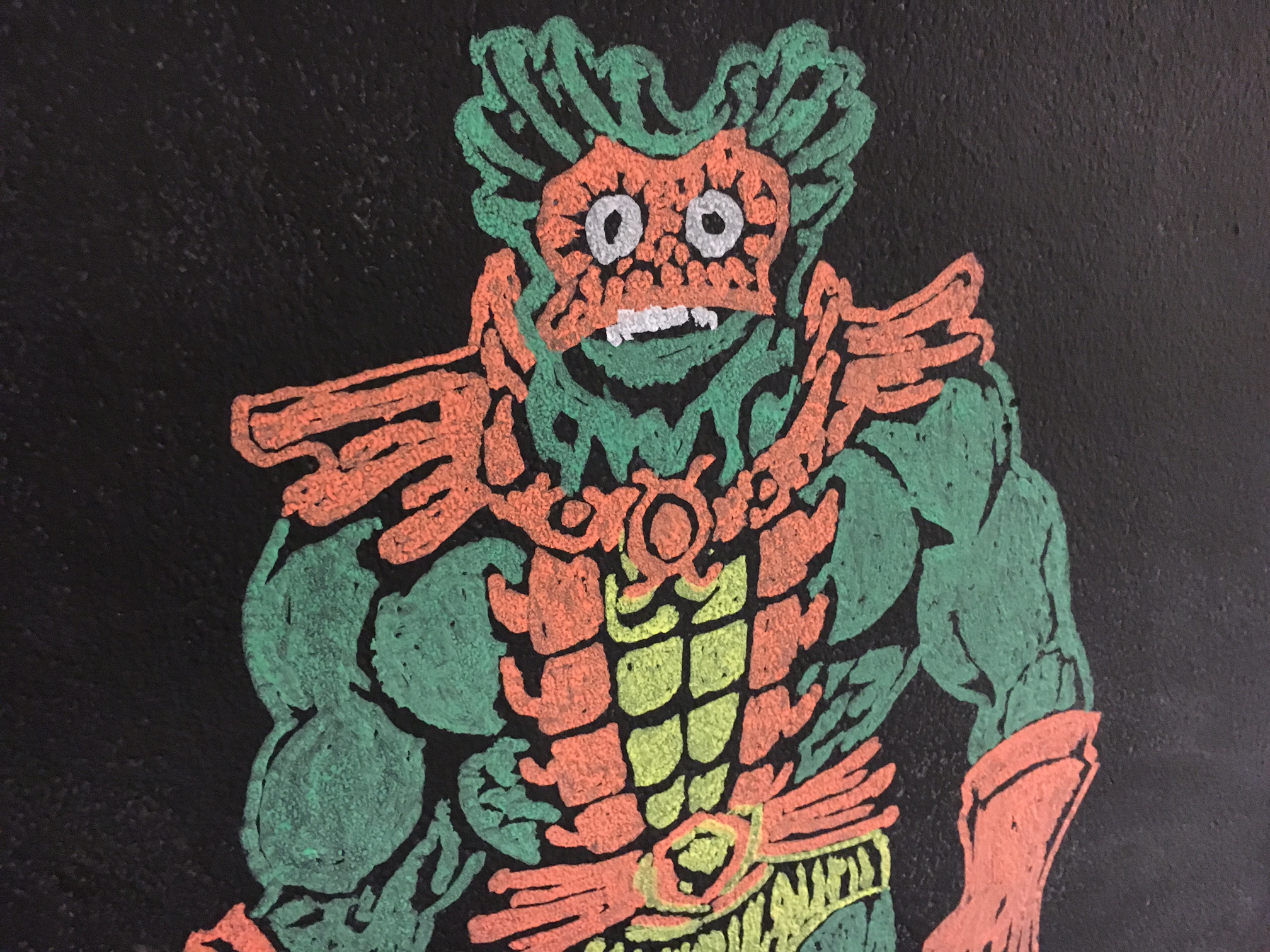
Once you have the image projected, it really just becomes an easy job of tracing the image and coloring it in.  As you can see from the image above, you can get really creative by overlapping and mixing different images onto your "canvas". One trick with the coloring book style is to use negative space for the black lines in the drawing. You can see the image below for another closeup to see how the effect works. 

Notice the details are made from negative space - leaving the canvas clear of chalk

Notice the details are made from negative space - leaving the canvas clear of chalk

So as you can see, it's nothing difficult or tricky and yet you can get some really fun results.  In total, the time it took me to trace these coloring book images was about 20 minutes for each one.  An additional benefit to this being all done in chalk is when you are done, some water and a sponge and it's all gone, back to fresh canvas. I think my next version will be some 8-bit inspired video game characters. 

NASA & JPL Visions of the Future

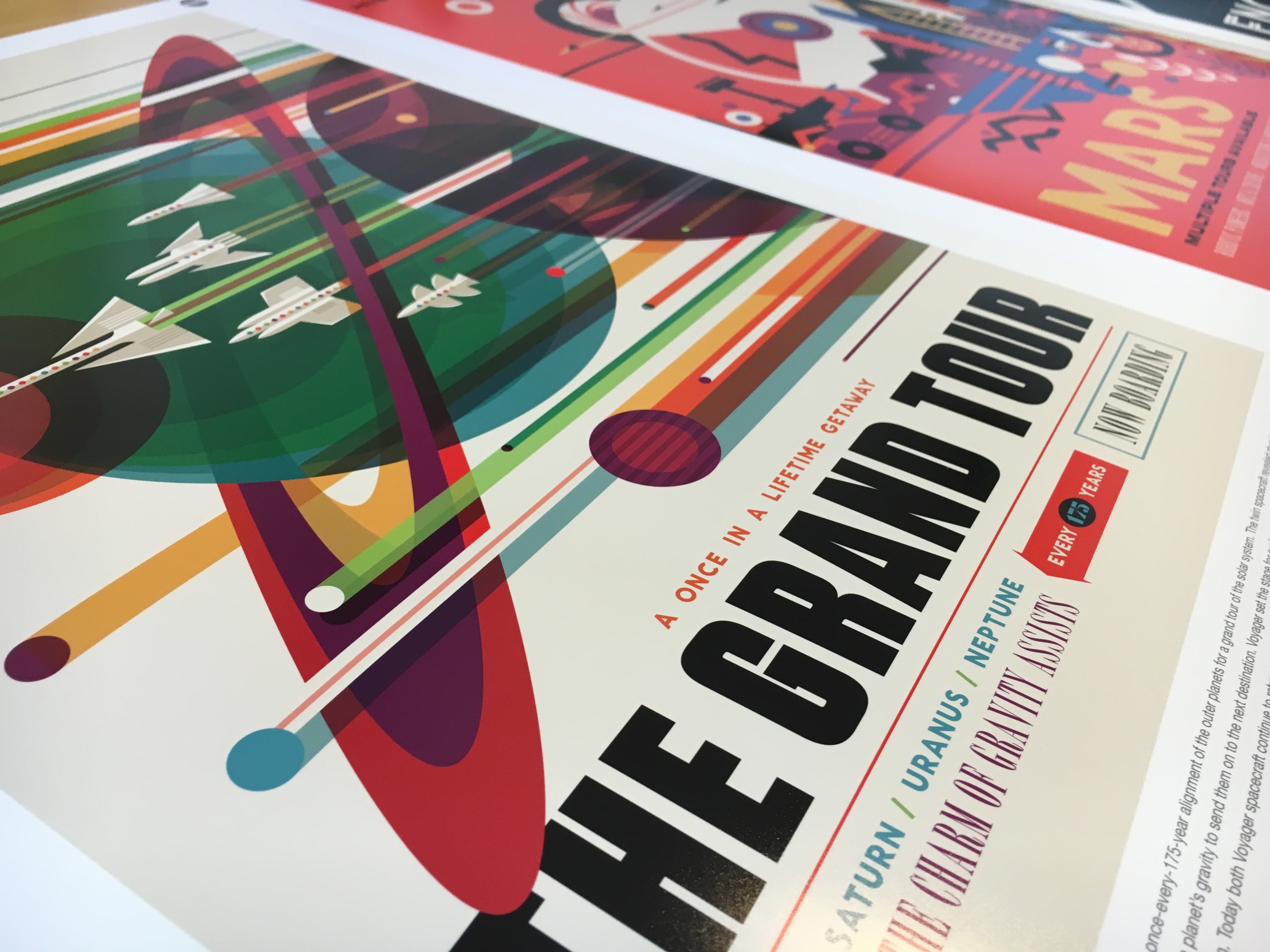
Recently, NASA and JPL released a series of graphic design posters that illustrate some of the possible space explorations entitled Visions of the Future.  JPL has released these posters for download, they are high resolution and can be printed in full resolution up to poster size.  These posters not only showcase the imagination of a new generation of innovators and explores, but also serves as a visual inspiration to anyone interested in graphic design, or the genre of space science.  One of the attributes of this series I enjoyed the most was the style of the posters, they mimic the science fiction imagery we are used to seeing on fictional books, games, and movies, yet each of these posters depicts real world "moon shot" exploration projects into our own solar system, and beyond. 

So if you are wanting to print off your own copy, you might ask "how do I print these big"? To help answer that I've included some tips below on printing theses off at the small poster size of 13x19" (also known as Super A3).   

For printing, I used Adobe Photoshop CC 2015 and an Epson Stylus Pro 3880 Printer on Epson Premium Semigloss Photopaper.  So as mentioned above the full resolution (300 dpi) these images can be printed in full poster size of 20x30" which is rather large, and for the wall space I have in mind for these prints, far too large.  So I decided to print on Super A3 (13x19") so I could print a selected series of three images to be wall mounted side by side.  To ensure proper printing (color, resolution, and size) I used the following settings in Photoshop to print.

NASA Image Opened in Photoshop

NASA Image Opened in Photoshop

To ensure the proper print settings I used the following (see image below for more details):

  • Paper size: ensure the paper size is correct - in this case Super A3
  • Color Management: Here I chose to have Photoshop handled the color profile that was embedded in the image to match it to the preferred printer profile.
  • Printer Profile: For best results I matched the printer profile to the Epson Stylus Pro 3880 and the exact paper I was printing on (Epson Premium Semigloss Paper).
  • Size and Resolution: Here I opted to "Scale to fit Media" so I would still retain the full border less printing of the entire image on Super A3 paper.  As a result of this the final print resolution is 463 PPI which is far more than needed (300 PPI) for a great result.  
Print Selection Dialog Box - Photoshop & Epson 3880 Settings

Print Selection Dialog Box - Photoshop & Epson 3880 Settings

The result is a sharp, fun, and inspirational graphic art poster. These would look great in your home/office or classroom.  I plan to hang these above an editing station in the Media Studio to help inspire some creativity from my students.

PHOT3190 - A new Class of Digital Artists

Course Description:

Students learn the theoretical and practical aspects of photographic digital imaging. Students develop a theoretical understanding of this technology and learn to apply these principles using Adobe Photoshop. Students learn to control, modify, and manipulate digital photographic images for both corrective and creative purposes.

In this course students used Adobe Photoshop (and Camera RAW) to explore the realm of digital image processing and manipulation. This course required students to look at taking imagery from a variety of sources and creating unique digital images. Students spent a lot of time on learning the Photoshop environment and how to work with digital files to bring their creative visions to life.

Class-Image-Web
Class-Image-Web

Reflection:

For this eight week course I used a scaffolding of projects to ratchet up the technical requirements (Photoshop manipulation skills) as well as increased creative control over the subject and composition of thier projects.  In total, three course projects were used, each building upon the previous project.  The first project (the most restrictive, and most simplistic) was focused on using state of the art equipment (cameras) and software (Photoshop) to re-create the visual aesthetics of vintage toy film cameras (styles made immensely popular via Instagram/Hipstamatic etc).  The second project focused on the theme of the self portrait, but the students were to re-imagine what the essence of a self portrait is and explore ways to visually compose an image that encompasses their abstraction of the "self image".  Finally, students were given an open ended project entitled the Uelsmann Experience, incorporating some of the free flowing design and creative process of image creation influenced by the legendary creative couple Jerry Uelsmann and Maggie Taylor.  For this final project students were to come up with their own image theme and develop a creative strategy to accomplish their vision.  This project can sometimes give "too" much creative freedom in which its vital to consult with each student to ensure the scope of their project is manageable in the timeframe of the course.

Throughout the course students engaged in small activities and in-class tutorial challenges focused on having the students learn new image manipulation techniques and put them to use in a time controlled environment.  This challenge scenario was used to enforce my belief that in the creative process, especially in digital image creation the point of failure is where we learn the most about ourselves and the techniques used.  For this class I wanted to create a "safe place to fail" - meaning I wanted the students to push themselves beyond their comfort zones and to try new techniques and ways of approaching the creative process without the fear that failing to succeed in their experiment would translate into an academic failure.

Overall, the individual growth demonstrated by each student, non only in technical proficiency, but in the creative process as artists was extensive.  Students were able to demonstrate a clear and purposeful rationale behind the technical, aesthetic, and compositional elements of each of their completed project pieces.

To cap the course off on the last day I put together a short time-lapse video of the class picture I created from a series of individual portraits taken earlier in the course (under the guise of a hands on tutorial on portraiture).  I wanted to use this simple image as both a visual "thank you" to the course, but to also serve as an example of how to re-imagine the "class picture" in a way that is contemporary and fun.  A Super A3 poster was printed in class on the last day and signed by each of the students as a momento that will be proudly displayed in my office.

For more information you can checkout the open course website: PHOT3190 Spring 2013 Webster University Leiden

Award Winning Course Design

AT&T Awards CEP807
AT&T Awards CEP807

I am proud to share the news that one of the online courses I have taught and developed has been recognized with an award of excellence in instructional technology.  The course CEP807/ED870 is the capstone course for the MAET Program at Michigan State University that requires students to develop an online portfolio sharing their academic, professional achievements and essay reflections.  This course encompasses many features, but most prominently are: authentic audience, learning by doing, peer learning, and public scholarship.

For the full story and recap of the course design visit the official 2013 AT&T Award Competition in Instructional Technology site.

Emotional Map Design - Experience iTunes

 Experience to study: purchasing an album on iTunes.

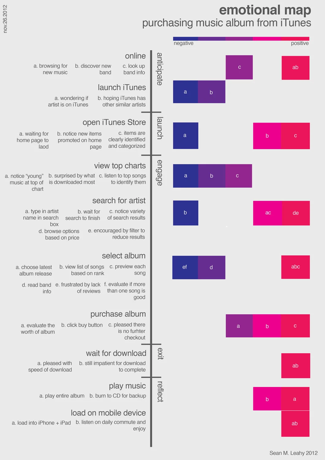
Emotional Map – a visual representation of the user experience of purchasing an album through Apple’s iTunes music store.  The Map can be read by using the vertical line to represent the main timeline of the process, with the horizontal text on the left indicating the individual steps in the process.  The lettered notes are indicated within each step, then mapped in color that ranges from negative (blue) emotion to positive (red) emotional experience.

emotionmap-SML
emotionmap-SML

Latent opportunities are ubiquitous: Pick an environment For this emotional experience I have established that I will study my own emotional experience of purchasing a digital music album online.

Who or what to study: For this study I will map my emotional experience of purchasing a music album from Apple iTunes from my laptop computer.

Establish a goal: My goal for this study is to identify areas of my experience that could be improved upon based on my emotional response to the various aspects of the experience.

Establishing modes and identifying touch-points:Modes:

  • Anticipation: Anticipation is the first mode, where the user reflects on the idea of purchasing a new album from iTunes.  Reflecting on previous experiences of purchasing music through iTunes from various devices, and any feelings of excitement or trepidation that may shape how the interaction is approached.
  • Launch (Enter): This is the second step where the user actually opens iTunes Store and gains access to the library of music, videos, podcasts, and other media available for purchase.
  • Engage: This being the third step, is where most of the interaction takes place.  This step is where the user interacts with the various components of the iTunes store and contain the majority of the touch-points of the purchasing process.
  • Exit: This is the step in which you have completed the transaction and leave the iTunes Store environment after your purchase is completed.
  • Reflection: The final stage in which you reflect upon the recent experience of purchasing an album through iTunes and how it compares to the anticipation stage from which previous experiences were used to foreshadow how the current experience would go.

Touch-points:

  1. Online: (Anticipation)
    1. browsing music online searching for something new.
    2. Finding a new band/song that is catchy and new.
    3. Looking them up to see what other works they have, and band info.
    4. Launching iTunes (Anticipation)
      1. Hoping that the artists album will be available.
      2. Looking forward to seeing if iTunes has other similar matches that would be new “discoveries”.
      3. Opening iTunes Store: (Launch/Enter)
        1. Waiting for store homepage to load.
        2. Notice the new items promoted on the homepage.
        3. Enjoying the design layout of the iTunes store.
        4. Noticing the clear separation of categorical items (music, movies, tv shows, apps, books).
        5. View Top Rated Charts (Engage)
          1. Notice the “young” music at the top.
          2. Surprised by what is downloaded most.
          3. Click on few songs that are unfamiliar by artist/name.
          4. Search for specific artist (Engage)
            1. Type in search field artist name
            2. Waiting for iTunes search to be completed
            3. notice the variety of search results showing multiple albums/tracks
            4. browse options based on price
            5. encouraged by filter options that appear on left hand side
            6. Select Album (Engage)
              1. Click on album of interest (latest release)
              2. see list of songs and associated popularity (rating)
              3. preview songs (30 sec) - go through all
              4. read band info
              5. frustrated there are no reviews
              6. evaluate if there are more than one song that is good
              7. Purchase Album (Engage)
                1. Hover over “Buy Album” button to consider the value of the album based on song preview and album price.
                2. Click “Buy Album” button
                3. Please there is no further “checkout process”
                4. Wait for Download (Exit)
                  1. Downloads fast pleasing that it doesn’t take much time.
                  2. impatient for entire album to finish.
                  3. Play Music (Reflection)
                    1. play entire album and listen to each song.
                    2. burn to CD for backup
                    3. Load music on mobile devices (Reflection)
                      1. load entire album on iPhone and iPad.
                      2. Listen to as travel music on daily commute.

This project was inspired by the Experience Map created by Erik Berkman from Little Spring Designs on improving the Starbucks experience.